Name: Manchester City Branding
Type: Brand Identity
Description:
The City of Manchester is one of the biggest cities in UK. Manchester is a place where many working-class people lived during industrial revolution. However, as time passed, those factories relocated to out of Manchester. Without sacrificing the value of “The City of the Working Class”, the design challenge was to project a new identity for Manchester.
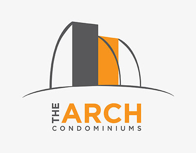
The logo was combined with 3 parts of the city. The main section of the logo incorporates an antique building to show that this city has amazing history. The hexagonal shape is the combination of beehive and rose which can be found in the coat of arms.
Icons were developed to represent their famous places. However, they were also generalized to ensure that people do not get confused when they look at the signs. The word ‘Hard’ was used in each icon to explain to newcomers that the city has passion to work and enjoy hard.


